May 07, 2021
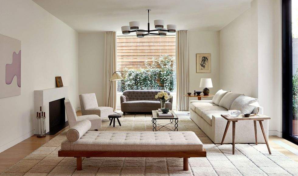
Interior design by Alyssa Kapito. Photography by Joshua McHugh.
Perhaps the most important visual element of a rug is its colors—a color scheme is a luxury rug’s best chance at showing its personality and establishing its presence. Pantone, the authority on color in the design world, has selected two contrasting colors for 2021 (as opposed to the usual one): Ultimate Gray (which lives up to its namesake) and Illuminating, a bright and cheery lemon-yellow shade.
It’s no wonder, in this time of contradictions, that Pantone opted to select two shades that seem to be at odds with one another. A dark and commanding gray is classic, neutral and serious, reflecting the still-grim nature of a recovering world. And then there’s that cool yellow—a bit sharper than canary, but more ethereal than golden.
On its face, Illuminating is simply representative of spring—cheery and refreshing, and certainly optimistic. On a deeper level, this happy hue is a symbol of a sunny year after a long and bitter battle with a pandemic that only seems now to be winding down. Around the world, people are changing their homes and office spaces to accommodate a new way of life that in many cases may be permanent. After many years of plain neutrals dominating, there is strong evidence of a trend shift, as tastemakers are paving the way for more colorful, offbeat, primary color–saturated interiors.
"It's a combination that speaks to the resilience, the optimism and hope and positivity that we need, as we reset, renew, reimagine and reinvent," said Laurie Pressman, vice president of the Pantone Color Institute in an interview with CNN.
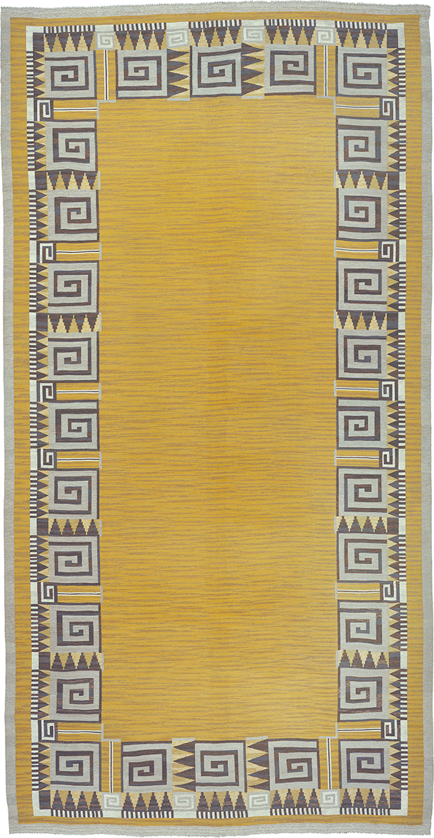
Swedish Flat Weave Rug #02762. Sweden ca. 1940. 23'3" x 12'1" (709 x 368 cm)
Yellow’s Importance in Historical Design
In his aptly titled book, Yellow, color expert Michel Pastoreau discusses the historical significance of the hue in art, design, and culture: “In antiquity, yellow was almost sacred, a symbol of light, warmth, and prosperity. It became highly ambivalent in medieval Europe: greenish yellow came to signify demonic sulfur and bile, the color of forgers, lawless knights, Judas, and Lucifer—while warm yellow recalled honey and gold, serving as a sign of pleasure and abundance. In Asia, yellow has generally had a positive meaning. In ancient China, yellow clothing was reserved for the emperor, while in India the color is associated with happiness. Above all, yellow is the color of Buddhism, whose temple doors are marked with it.” Resoundingly, yellow seems to be among the most upbeat of choices for interiors.
The two hues of 2021, striking both together and apart, are part of a larger picture of where post-COVID design trends are leading designers into the future. With longer stints at home for many, as well as new feels for office environments, designers have started to rethink the idea of an open concept as the king of floor plans. Instead, privacy is the keyword, keeping personal space and acoustics in mind for a more work-at-home-friendly atmosphere or an office that prioritizes separation. In addition, the dominance of beige-based neutrals has gone by the wayside in favor of pops of pick-me-up brights or deep-and-regal darks.
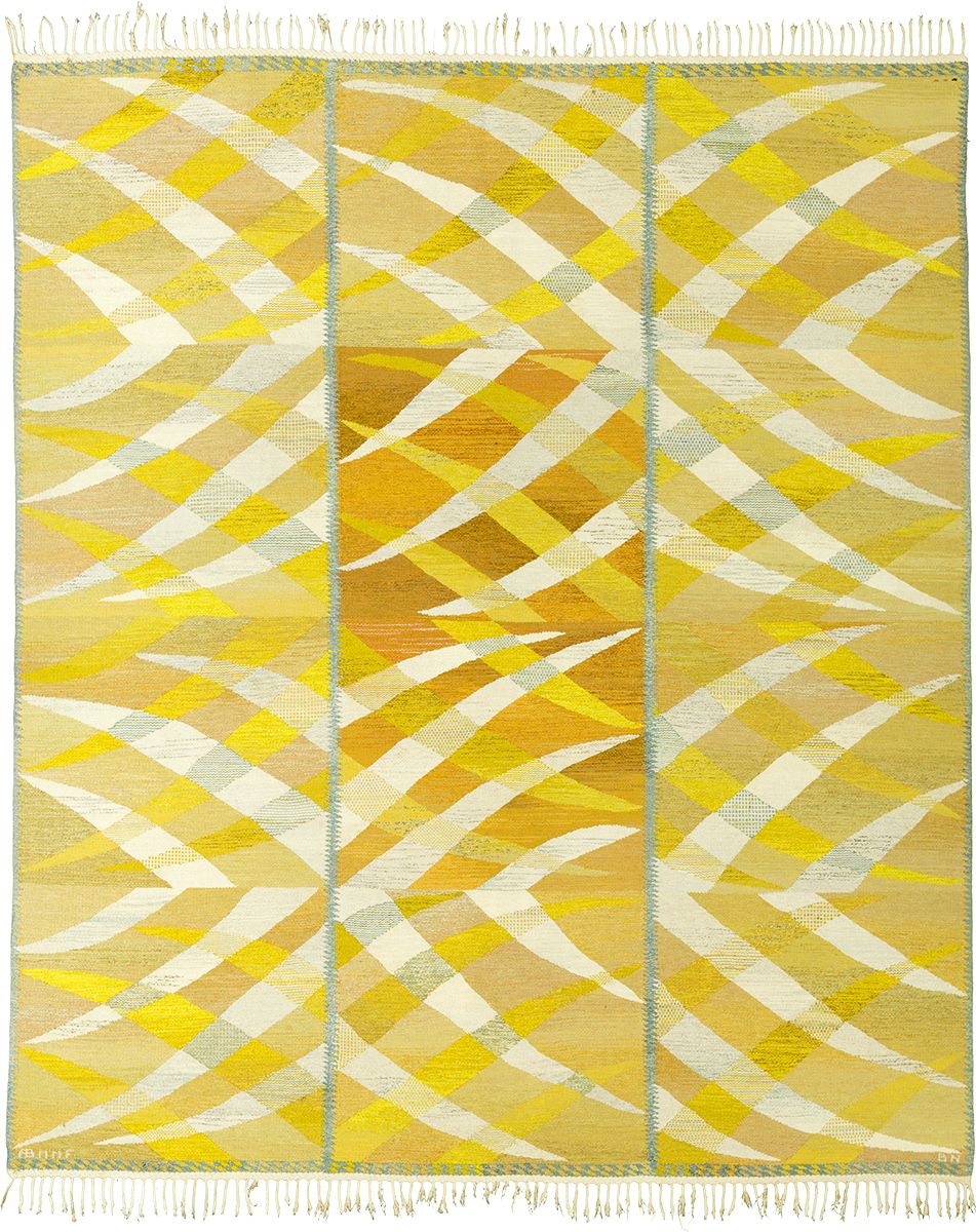
Swedish Flat Weave Rug #22165. Sweden ca. 1964. 10'7" x 9'1" (323 x 277 cm)
Gray as a Conduit for Emotion in Art
Pantone’s choice of Ultimate Gray for 2021 is certainly not the first time the light-meets-dark shade has been used to convey a sense of deep emotion as well as contrast. Gray was a popular choice in Renaissance Art; during a time when traditions were coming into question and art techniques were quickly advancing, paintings went from strictly religious depictions to deeply heavy and dramatic ones. Even pre-Renaissance, during the Middle Ages, grisaille oil paintings—monochromatic and textured images of holy figures and events, were popular in Europe. This technique employed various shades and tints of gray to create gloomy-yet-powerful still life scenes. Later, the paintings of masters like El Greco and Rembrandt employed gray, and general dark-against-like chiaroscuro, to convey a photorealistic, somber, and impactful mood.
The parallels of a post-COVID era to the Renaissance are undeniable; as society emerges from a global pandemic, color will again serve to both illuminate the path ahead and underscore the depth of the lingering effects.
Art Deco Rug #03416. Belgium ca. 1940. 12'8" x 9'8" (386 x 295 cm)
Color, Novelty, and Pragmatism
Yellow and gray are two excellent examples of the light-and-dark duality of this era. Yellow is a totally unexpected and often overlooked accent color. Gone are the days of dusty, pale yellow shades that marked the late 1990s; Pantone’s Illuminating is saturated and fresh, but avoids being jarring and is still a primary color, lending to its ultimate versatility in all types of spaces.
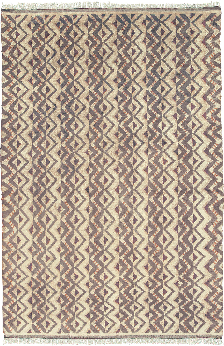
Swedish Pile Rug #03388. Sweden ca. 1950. 18'3" x 12'1" (556 x 368 cm)
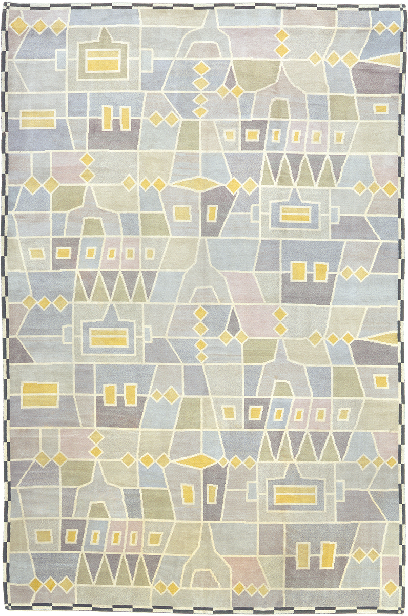
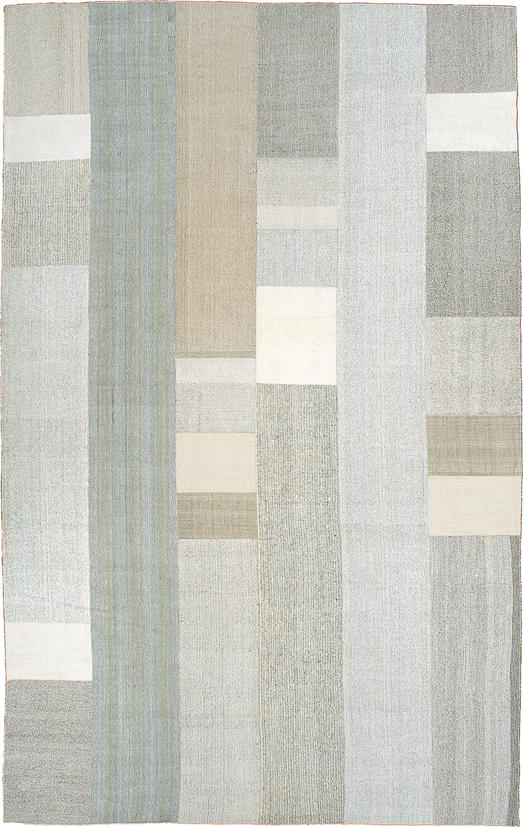
Vintage Kilim Composition #23235. 1940's Turkish panels. 19'1" x 12'1" (582 x 368 cm)
While gray it often is classified as a neutral, and certainly can act as one, gray is not as essentially neutral as white or beige. Depending on whether it has a blue, violet, green, brown, or true-neutral undertone, gray can accentuate with or clash with certain hues. Ultimate Gray, a brown-leaning shade that does not often appear in nature, lending it a more modern quality, is a refreshing take on a neutral and carries forward the “moody” interiors trend that has marked Scandinavian design over the past decade.
Head of color for WGSN, Jenny Clark, predicted two distinct color stories in the years to come: one calming and muted (read: gray) and the other, happy (read: yellow), as told to Tim Nelson of ADPro. “Nature has been and will continue to be a huge driver; not only do muted tones feel comforting, they also connect us to the outdoors . . . The second mindset is a more playful, expressive approach using brighter colors that bring a sense of joy and escapism.”
Similar color trends are also evoking the raw emotions of this time. Clark observes that golden tones represent “uplifting warmth” while rich browns “project strength and longevity,” Nelson writes, “harkening back to prior eras of history and design.” Still, punchier colors project “our desire for small, luxurious accents and precious, natural things.”
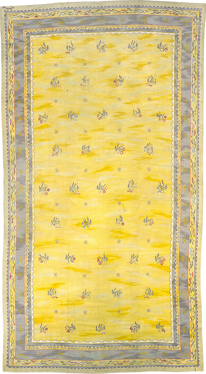
Swedish Pile Rug #03262. Sweden ca. 1927. 20'6" x 11'0" (625 x 335 cm)
As with any element of interior design, the economy and state of life around the world bear a huge macro and micro impact on our aesthetic choices.
Clark of WGSN notes that consumer desires and other factors that are not normally in play when it comes to economic outlook will continue to weigh heavily on design choices. “The biggest change to current color trends will be linked to the economic outlook,” she says. “Once a vaccine is found and economies start to recover, there will be a shift to a more positive mindset and this will impact color. How long that takes, no one knows.”
Focus on Function
The nature of a pandemic lends itself to physical distancing and other spatial changes in everyday life. Naturally, this lends itself to the architecture and design of a space. A number of major players in the architecture and design world spoke to Elle Decor, noting what functional changes would come in the era to come.
Architects Jenny and Anda French, for example, said, “In a post-COVID world, consider how life might become more multigenerational, with extended family moving in. For us that aligns with the form of collective housing known as cohousing.” Designer Joy Moyler noted, in a sound-focused perspective, “There will be a return to cork walls for reduction of sound transmission. We’ll also use more efficient window-glazing films to reduce screen glare on monitors and enhance video presentations.” And architect Toshiko Mori discussed perhaps the single most important consideration in a room: light. “There needs to be greater consideration for artificial and natural ventilation and lighting strategies,” he said, “in order to maintain good interior air quality and mental well-being.”
When used together, these two shades can be magical—a completely original, sharply contrasting duo. The power of contrast is never to be underestimated, especially when it involves two shades that are not directly across the color wheel from one another, as a typical pairing would be. And apart? Each is a sign of the times in its own way, and both are able to be incorporated into the new way we live and use color into our daily lives, at home or in the workplace. At FJ Hakimian, both our antique and contemporary custom rugs, across all lines, types and origins, have these two colors incorporated into simple and intricate patterns that capture the zeitgeist of 2021.
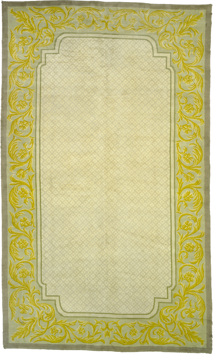
Savonnerie Style Rug #03078. Spain ca. 1930. 18'7" x 10'11" (566 x 333 cm)
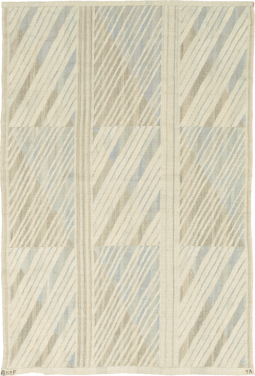
Swedish Wall Hanging #22154. Sweden ca. 1940. 6'3" x 4'1" (191 x 124 cm)

