October 31, 2018
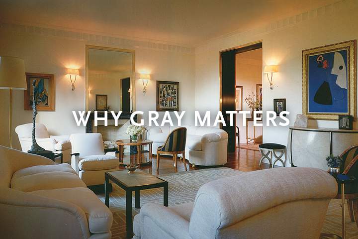
A warm, creamy gray, almost like antique shagreen, is an ideal backdrop for the Art Deco-era paintings and furnishings in this Central Park living room designed by the late Jed Johnson. Interior Design magazine believed this room to be the most “mature manifestation” of Johnson’s talent, where he “emboldened the mix of paintings by Klee, Legaer, Miro and Picasso, muted it all with a palette of natural colors and materials and left the owners with plenty of space to breathe.”
“The single most important lesson of architectural color is that every color only appears to be what it is relative to its surroundings,” explains Donald Kaufman, the famed color consultant. This is a lesson long known to artists who value gray for its supporting role—in the Renaissance gray was the preferred portrait background to emphasize the richness of the sitters’ costumes, while the Impressionists and Fauvists, for all their love of color, often used gray to make their other colors spark with life.
Throughout the centuries gray has been used by architects and designers to enhance light and emphasize architectural features. In the 15th c. Filippo Brunelleschi used gray pietra serena to highlight the perfect geometry of the white marble and plaster in the Basilica of San Lorenzo in Florence. The elegant powdered wigs and detailed brocaded fabrics of 18th c. France were set against pale gray walls, while in Northern Europe refined Gustavian rooms combined a range of soft grays against pale wood floors.

FJ Hakimian Custom "Marion II" Carpet

FJ Hakimian Custom "Aqueduct" Carpet
Kaufman praises gray for its “chameleon-like” values and ability to function as a graceful transition between other colors in a house and other interior specialists agree. Kate Watson-Smyth, the British interiors journalist and blogger who quite literally wrote the book on gray (Shades of Grey, Ryland Peters & Small, 2017) explains that gray “…makes all other colors look great. It works just as well in a modern space as it does on panelling in a more traditional room. It’s the perfect neutral.”
Indeed, it’s that generosity of gray that makes it so wonderful to use in interiors. Interior designer Abigail Ahern, whose business skyrocketed when her home, which she painted in various shades of gray, was first featured in design magazines and blogs seven years ago, explains: “Anything set against gray looks more beautiful, more grand. It turns a room into a space that feels intriguing and sophisticated and glamorous.”

FJ Hakimian Custom "Broken Glass" Carpet
Indeed, it’s that generosity of gray that makes it so wonderful to use in interiors. Interior designer Abigail Ahern, whose business skyrocketed when her home, which she painted in various shades of gray, was first featured in design magazines and blogs seven years ago, explains: “Anything set against gray looks more beautiful, more grand. It turns a room into a space that feels intriguing and sophisticated and glamorous.”
Because gray is so infinitely varied in its shades, tones and intensities, it is also infinitely adaptable. Gray is both practical and romantic, ephemeral and hardworking, complementing both wood and concrete, marble and plaster, and at home in interiors both grandly classical and aggressively industrial.

FJ Hakimian Custom "Helix" Carpet

FJ Hakimian Custom "Palm Leaf" Carpet
In addition, the enormous spectrum of grays makes it a timeless option. A true gray is much more than the flat combination of white and black—instead each gray is a blend of everything ROYGBIV has to offer, with subtle tweaks to make one option warmer or another cooler, one deeper and another lighter. Gray helps pull together interiors, support other elements, and enrich other colors. Both effortlessly chic and flatteringly functional, gray is the ideal design partner for any interior.

The late Robert Metzger used a palette of classic “greige” shades to define architectural elements in this living room for a Hampton Designer Showcase, layering tones and textures to add visual interest without overwhelming the eye. This allows key design details, such as the artwork, the cloverleaf backdrop and potted palm, to add dramatic impact. Photo by Phillip H. Ennis.

FJ Hakimian Custom European Viennese Carpet

FJ Hakimian Custom "Boggeri" Carpet

FJ Hakimian Custom "Blok" Carpet